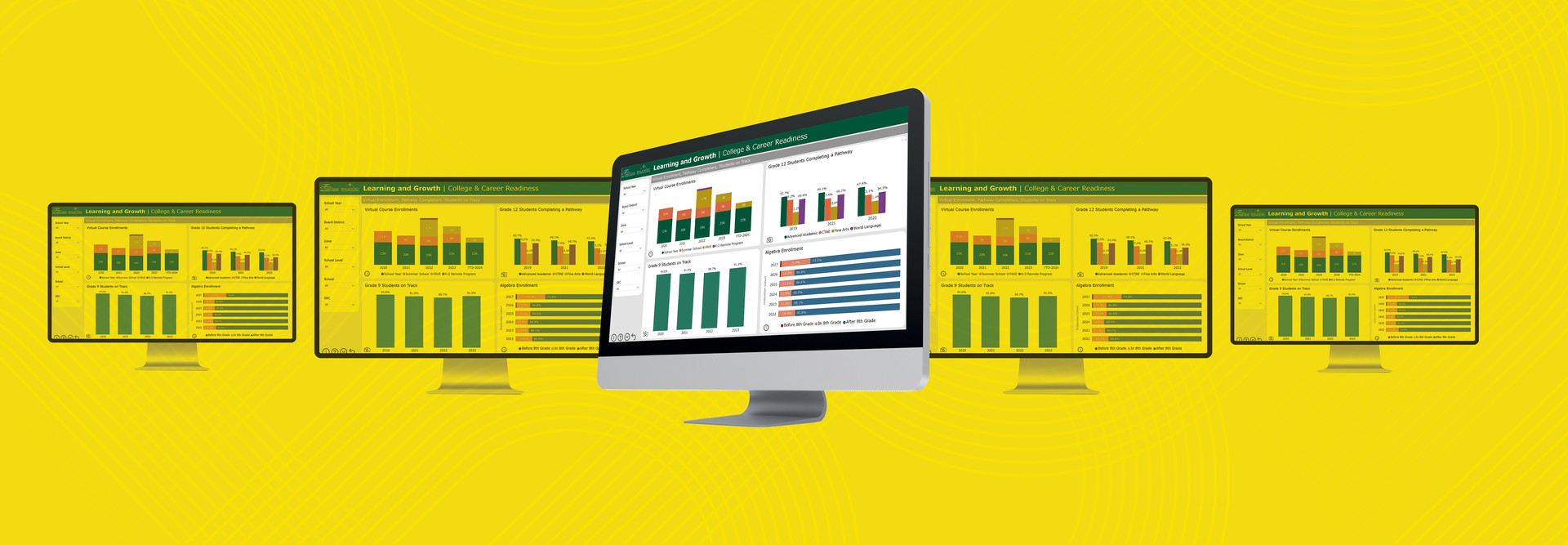
For over 20 years, Fulton County Schools in Atlanta provided an annual “balanced scorecard” to stakeholders in a PDF format that included point-in-time data from all areas of the organization. However, school leaders wanted to modernize their approach so that stakeholders could get more specific, targeted and real-time information. As we looked for a comprehensive data analytics solution, it soon became clear that Microsoft’s Power BI was the best choice for us.
The business intelligence software allowed us to aggregate 21 years of data in four topical buckets, with 18 links and hundreds of metrics on a visualized, easily accessible and easy-to-navigate dashboard.
The digital balanced scorecard generated in Power BI represents a comprehensive collection of key metrics that provide data transparency while maintaining student data privacy. Sample metrics include real-time student enrollment and demographics, per-pupil and programmatic funding breakdowns, and the status of facilities work orders at buildings throughout the district.
Click the banner to see how data can give schools an advantage.
Power BI Easily Integrates with Multiple Data Sources
Connecting data to Power BI is simple and efficient, if you use data that's centralized, secured and structured before you create the visualization.
Because data can be drawn from disparate systems without a central repository, Power BI’s easy connections to data can reduce time to deliver. We use Power BI to leverage our on-premises data warehouses or cloud-based data lakes.
A data lake or data warehouse can seamlessly pull data into Power BI from many sources — such as cloud-based applications (via an application programming interface), automated Excel file extractions or single-use flat files — to effortlessly create visualizations.
DIG DEEPER: Five tips for effectively curating student data.
Power BI can also connect to a tabular model, which connects databases to back-end relational data sources. The software’s AI Insights feature allows users to access a selection of pretrained machine learning and artificial intelligence algorithms that can enhance data transformation and structuring.
Power BI can also pull data from a school’s student information system and an instruction-based prescriptive-diagnostic platform to create one visualization that uses information from data sources. Showing data from different systems on a single screen helps users to understand the big picture. Such capabilities make data more available and more actionable in support of district goals.
Power BI Users Get Upgraded Visuals and Metrics
Before we had Power BI, our team primarily used Excel as a visualization tool. However, with Power BI, we have customized visuals and metrics that enhance the user experience.
Developers with a strong background in data visualization will need to be familiar with Data Analysis Expressions, the query language that’s used to build formulas and expressions in various Microsoft apps. The Power BI interface allows for drag-and-drop visualizations, and Microsoft Learn provides a platform on which developers can collaborate and receive feedback and assistance.
Because many people become overwhelmed with data graphs and charts, Power BI offers on-screen aids to improve usability and data literacy. It also offers helpful icons and overlays that can be used to provide tutorials or detailed information about business rules for data visualizations.
DISCOVER: Measure ROI to show the value of ed tech purchases.
Power BI’s Real-Time Data Helps Educators Track Student Progress
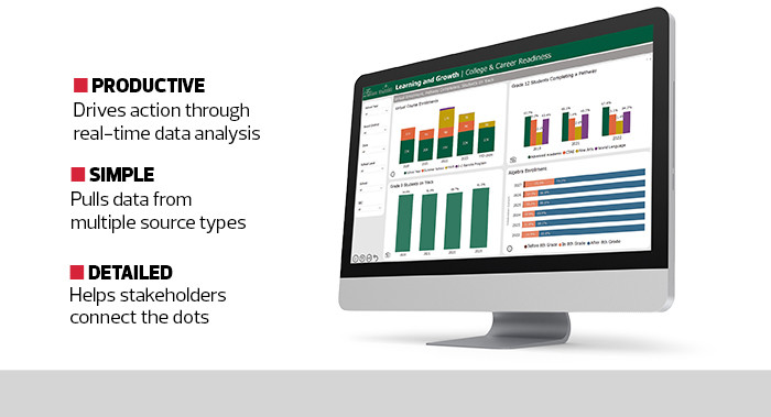
Because of Power BI’s easy integration with data platforms, nightly updates can replace lagging data with real-time data. Such timely information enables school leaders to better track program activities and instructor and student progress so adjustments can be made as needed.
These data visualizations can drive improvement action plans at both the school and district levels. Among the many data tools our district has tried, Power BI is the most effective.
SPECIFICATIONS
PRODUCT TYPE: Data visualization software
DEPLOYMENT: As a service
LICENSE: Subscription


