Microsoft Optimizes OneNote’s User Interface to Boost Classroom Accessibility
When Microsoft OneNote was released in 2003, the company intended it to be a personal notetaking tool for businesses and college students. Now that a huge number of K–12 classrooms have one-to-one devices, OneNote’s director of product design acknowledges that Microsoft sees they have a whole new batch of customers to serve.
“That shift in available technology really opened a new collaborative scenario for OneNote,” says March Rogers, who has headed up the product design team since August 2015.
With teachers in mind — and thanks to Microsoft’s dedication to gathering teacher feedback — the tech giant has already updated OneNote by creating Class Notebooks to organize content.
OneNote was updated last year with Learning Tools to help students suffering from dyslexia improve their reading through “read aloud” features and text spacing assistance.
When her school district rolled out Microsoft Office 365 a few years ago, Georgia special education teacher Lauren Pittman began to use OneNote to help her students stay organized and work independently. With Learning Tools, she has really seen her students thrive.
“It’s really helped to organize my students and give them the opportunity to be independent, and then really help me to be more present as a teacher because I can now help with really specific things,” says Pittman, who teaches at Holly Springs Elementary outside Atlanta. “We can really have much more in-depth and rich lessons because they are able to do basic things themselves.”
Today, in honor of Global Accessibility Awareness Day, Microsoft has announced a redesign of OneNote’s user interface to further boost its accessibility to all students.
Interface Updates Create Consistency and Simplicity
“There have been several times that I’ve heard a story of a teacher finding an interesting tech tool, but not adopting it because it wouldn’t be accessible for all students in their class,” says Rogers. “The idea of accessibility being a deal-breaker to teachers adopting technology really inspired us to look at our application.”
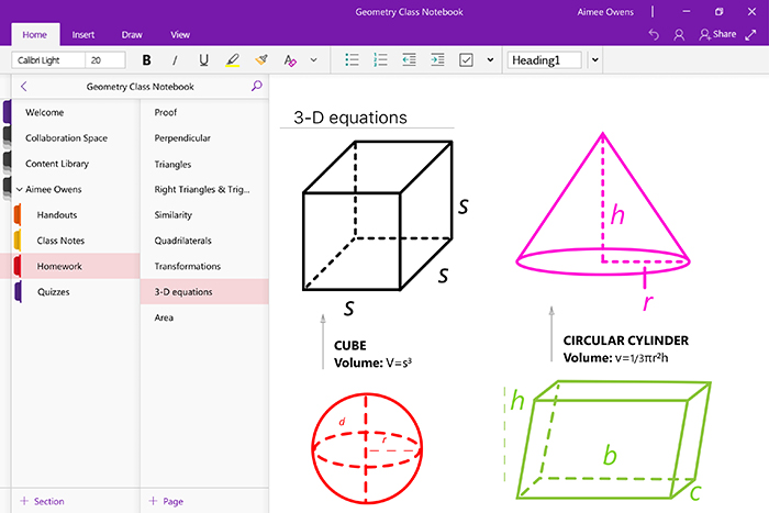
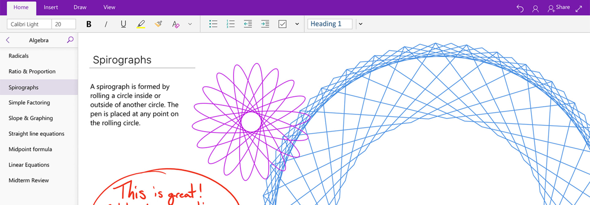
A big part of OneNote’s refresh is a new cohesive learning experience across all screens, according to a Microsoft blog post. With this update, OneNote will look exactly the same no matter the make and model of the device, which will make it easier for all students to work at home.
For Pittman, the devices in her classroom tend to be whatever they “can get their hands on.” Her students work on everything from a Surface Pro 3 to laptops and desktops. With her students working on a variety of operating systems, consistency is important in the tool they are all using.
Also, to create simplicity, OneNote’s navigation layout has been changed to an easily managed subfolder system. Rogers says educators have been able to use OneNote to create powerful notebooks with a lot of sections and subfolders, but the complexity often caused confusion.

“Having talked to dozens of teachers about this problem, it became clear to us that we could find an easier navigation method where you could switch sections easily,” says Rogers.
After testing the new interface tools, Pittman’s students — who are easily overwhelmed by complex interfaces — have been able to stay on task.
“I used to have to make sure that they were all on the right page at the right time. Now, just using the folders, I can tell them exactly where to go and it has cut down a lot of the class time being used just to find material.”
OneNote’s update will be rolling out across devices in the next few weeks.


