Welcome to EdTech’s Redesigned Website

There's no denying it: The way we consume and share content has changed dramatically over the past few years. Today, with the mobile revolution, the Internet's wealth of information is always at our fingertips.
In the Spring issue, I described how we redesigned the print edition of EdTech: Focus on K–12 to deliver a clean and modern aesthetic with some new content offerings.
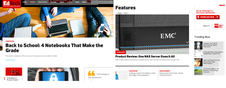
But the EdTech website has also been retooled. The pinch-and-zoom struggle of visiting a nonresponsive version of the site is gone. Whether you're reading on a tablet, smartphone or desktop computer, you'll find that site content automatically adjusts to your screen's requirements.
Get On Board the Digital Stream
EdTech has been telling K–12 IT stories for more than a dozen years. Hearing the stories of your peers resonates, so we've added a tab on the homepage that allows you to more easily find those about other schools and districts in your state.
We've also translated our print section, "Report Card," into a new site feature that displays a constant update of news on assorted topics. It's our way of introducing "the stream" to EdTech so readers can more quickly and easily keep up with a wider range of stories.
Additional new EdTech site sections include Features, for all long-form articles; Tips & Tactics, for how-to pieces and best practices; and C-Suite, for discussions, challenges and ideas that impact leaders at the highest levels of school and district governance.
Become an Insider
We've also created the "EdTech Insider" program. By signing up, you'll gain free access to our library of white papers, Tech Insights guides and other premium content.
The Insider program; the redesigned print edition; and fresh, responsive website design — all are examples of our ongoing efforts to deliver new and better service to our readers.


