Always Use Trusted and Reliable Data
Analytics is most successful when it culls data from a variety of sources. Some of these sources are internal to a university or university system, but other data, such as demographics, might be coming from third-party sources.
You know your own data. You likely have sufficient governance and security measures in place to ensure that it’s accurate. However, when you use third-party data, security and governance standards must also be aligned. Do your third-party providers enforce the same standards that you do? Is the data up to date? Can you rely on the data?
If you’re going to perform analytics and use it with dashboards for presentations and decision-making, you must trust the data.
FIND OUT: Why higher ed turns to data analytics to bolster student success.
Organize Data for the Issues at Hand
College and university data generally coalesces around four key constructs: achievement, demographics, programs and perception/survey data. Educators want to know if their students are succeeding; what demographic circumstances students come from; which programs and courses are most successful; and what parents, teachers and students think. Accordingly, the data repositories that dashboards use should, at a minimum, be able to address questions and issues in these four categories.
Prioritize Collaboration in Building Your Dashboards
IT understands the technology of dashboard building, but it doesn’t know the daily issues that educators face. Dashboards must address these issues. From the time a dashboard is conceptualized until the time it’s placed in production, educators and IT should be actively collaborating. If educators and IT fail to collaborate, they risk ending up with dashboards that have drifted away from what educators originally wanted.
RELATED: Collaboration tools for the future of online learning.
When Using a Dashboard, Ask the Right Questions
When using a dashboard, it’s important to ask the questions that will produce actionable results. If students appear to be dropping out of courses, the initial query might be to see what course dropout rates have been over the past five years. This might confirm the problem, but it doesn’t provide actionable solutions.
The next question might be to see which courses have high dropout rates. There also might be questions involving student demographics, who is teaching courses and how long it’s been since courses were revised.
The end goal should be a list of reasons for high dropout rates that are actionable.
Use Data to Tell a Story
Dashboards should paint a picture of the issue at hand. Perhaps the bottom line for rising dropout rates is that certain courses are outdated and should be revised or retired. Alternately, it might be that student comprehension and readiness have declined, and students aren’t succeeding in more academically demanding courses.
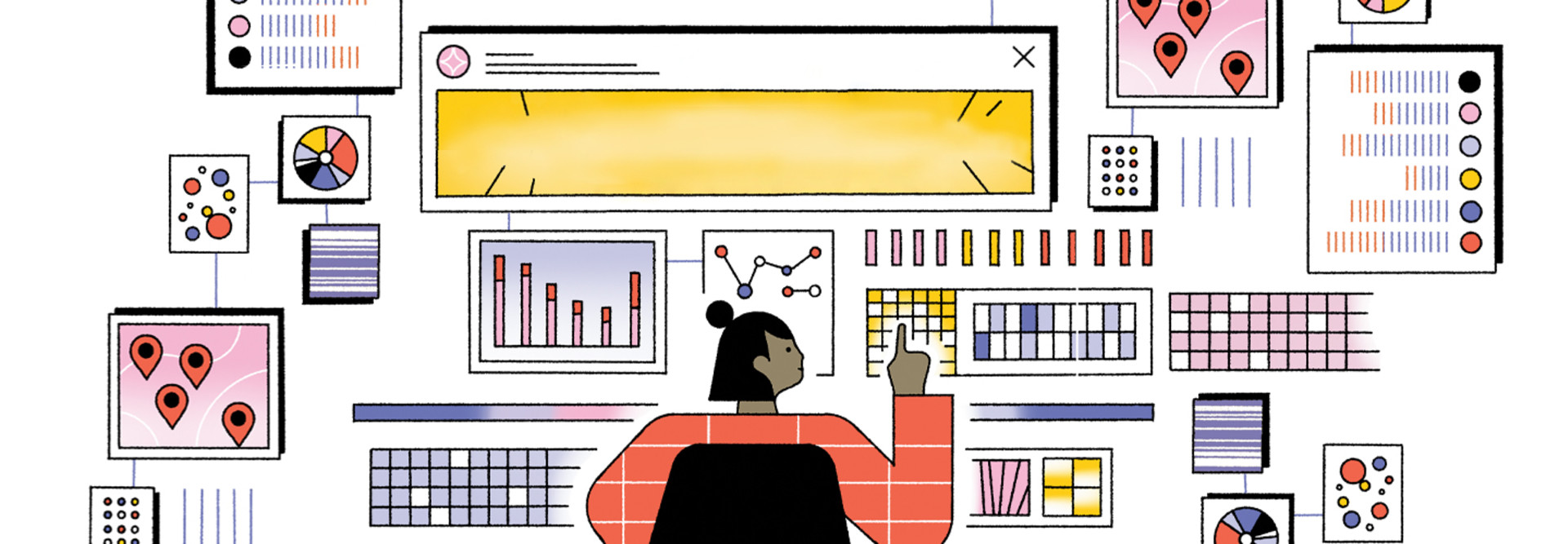
Whatever the main storyline is, a well-designed dashboard with widgets that can access information on each story element helps to orchestrate the story of a problem and what will solve it. Storytelling is further enhanced by wise choices of visual artifacts (graphs, pie charts, etc.) that can visually summarize the issue for viewers.
READ THE WHITE PAPER: Achieving effective data analysis in higher ed.
Calibrate Dashboard Visualizations to Your Audiences
You might be called upon to present information to different sets of stakeholders with varying information needs. If you are, it’s important to customize the visual portion of dashboard presentations to the needs of different audiences.
For instance, if you’re discussing rising dropout rates with trustees or staff, it might be useful to use a pie chart that illustrates which areas of study are exhibiting the highest dropout rates. If you’re meeting with city officials to discuss future workforce needs and you want to discuss dropout rates, it might be useful to use a heat map that locationally displays where the students dropping courses reside.
Dashboards are some of the most powerful tools that educators have to explore issues, unearth insights and communicate what they learn to others.
These tools are at their best when IT and educators actively collaborate for best-of-breed dashboards and analytics.


