3 College Websites with Responsive Design
The influx of mobile devices, such as tablets and smartphones, is powering a revolution in web design, including a device-agnostic style known as responsive web design. According to Smashing Magazine:
Responsive Web design is the approach that suggests that design and development should respond to the user’s behavior and environment based on screen size, platform and orientation. The practice consists of a mix of flexible grids and layouts, images and an intelligent use of CSS media queries.
Responsive design marks a significant change in the philosophy of web design and is proving to be extremely popular among the world’s 1.9 billion mobile Internet users. According to a recent study, 66 percent of Americans aged 18–29 own smartphones and 70 million Americans will use a tablet by the end of 2012. Web designers have to account for too many factors, and the user experience suffers as a result. Enter responsive design, which takes any screen into account and offers SEO benefits and long-term cost savings.
Here are three schools that have used this new approach to create beautiful websites. Change the size of your browser window to see them transform right before your eyes.
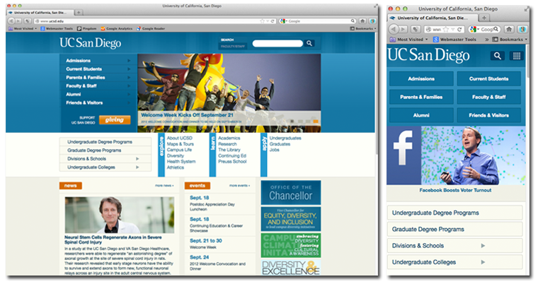
University of California, San Diego

Hendrix College

University of Notre Dame


