Data Visualization Tools Can Help Stop Cyber Attacks
Augmented and virtual reality can be used to go deep inside a human body or catch Pokémon on a city street. But, the technology also can be used to help analysts thwart a cyberattack or identify key trends quickly.
Researchers at Carnegie Mellon’s CyLab Security and Privacy Institute have developed a data visualization tool that can transform static network traffic data reports into pictures, video and sound that can be viewed through a VR headset or on a computer screen.

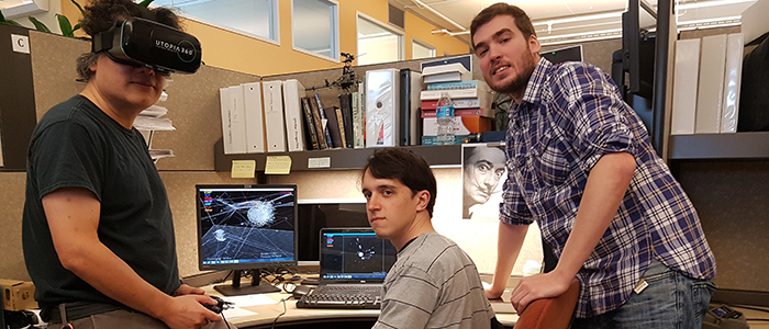
Dr. Yang Cai (left) and his research assistants, Sebastian Peryt (middle) and Pedro Pimentel (right) at the Visual Intelligence Studio of CyLab, Carnegie Mellon University, Pittsburgh.
“It’s very hard for analysts to look at 80 columns of a spreadsheet,” says Yang Cai, the director of the CyLab’s Visual Intelligence Studio. “Visualization makes it very easy to see the patterns.”
How Data Visualization Tools Can Quickly Detect Cyber Attacks
In October 2016, several major online services, including Twitter and Netflix, experienced a distributed denial of service attack that shut down their networks with a tidal wave of web traffic, CNN reports.
A report from the content delivery company Akamai states that DDoS attacks have risen 125 percent year over year. According to a best practices article on eSecurity Planet, the key to stopping such an attack from doing damage is to detect it early by being totally familiar with your network profile.
This is where visualization can be key. With thousands of pieces of network data being collected — much of it of little use — Cai says that visualization can help an analyst recognize anomalies, like a spike in traffic due to a DDoS attack.
“We focus on visualizing the network data traffic and the dynamic patterns that happen there,” says Cai. “Through 3D navigation, we can see how a virus propagates through a network.”
In a World of Big Data, Data Visualization Tools are Important
From the business world to higher education, data-driven decision-making is the trend. EDUCAUSE has repeatedly indicated that data mining is a key to student success. So, tools that can make this data easier to communicate are important.
A white paper from the software company Tableau identifies data visualization as a key factor in more easily analyzing student trends in enrollment, demographics and retention. But data visualization is also a critical tool for communicating to stakeholders.
The research from CyLab has been developed over the past five years; currently, Cai and his team are conducting case studies with real data from their network and from outside sources like the Tokyo Police Department.
“We are trying to make the tool more robust so that people outside of our lab can use it,” says Cai. “The inspector from the Tokyo Police Department feels it is very useful. He can see the patterns we found. Visualization makes it easy to communicate data in reports and also to jurors in court.”


